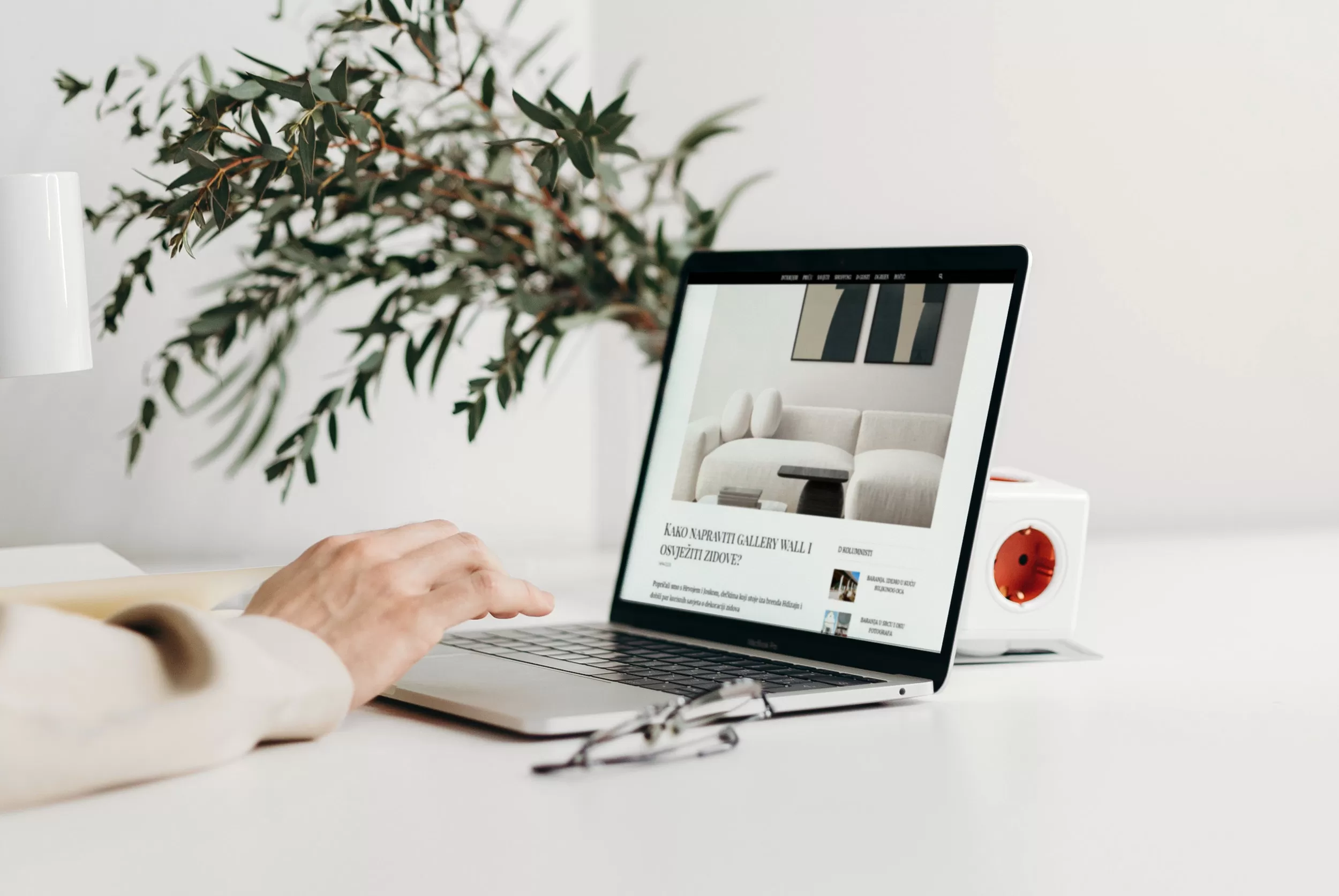
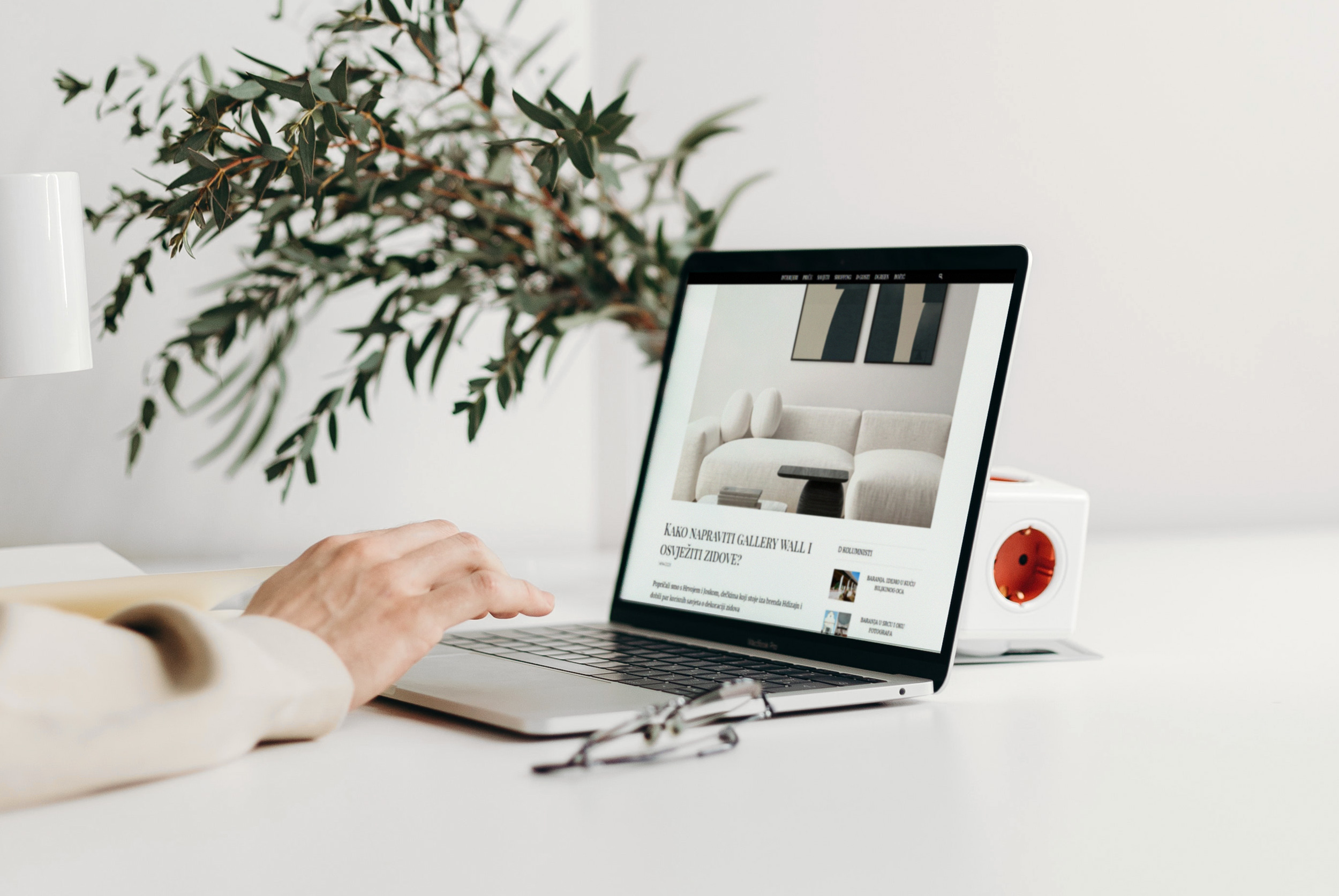
We are proud that an interview with us was recently published on the interior and design portal Dblog.hr, giving us the honor of presenting our project of designer posters for interior decoration and showcasing the visuals of some of our posters to the Dblog audience. Additionally, we spoke with the editor-in-chief of the mentioned portal, Boba Blašković, about some current trends and tips related to interior decoration with designer posters.
Do pictures look better on white, gray, or black walls? What about frames? Sizes?
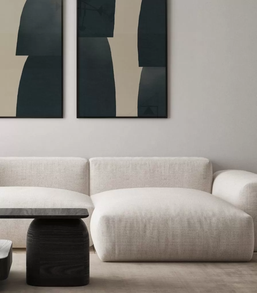
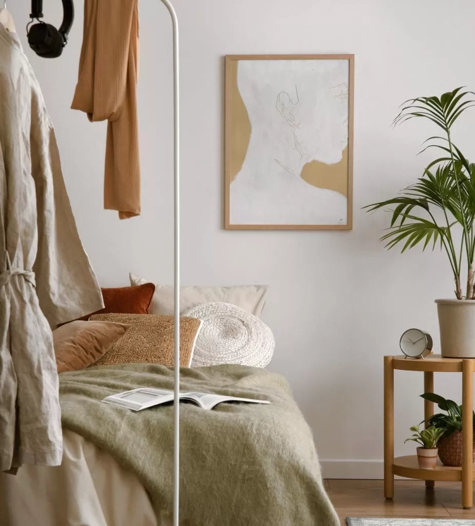
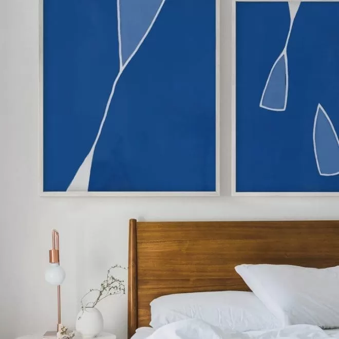
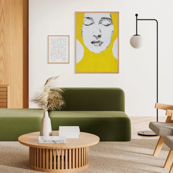
We definitely recommend lighter wall tones because they open up the space and don’t become tiresome as quickly as walls with more intense colors. Of course, on such neutral walls, posters stand out the most and play a dual role: they decorate the interior and bring life to the walls through their colors, shapes, and themes. As for frames, we also prefer white frames because they don’t confine the visual of the poster into a strict rectangular boundary, but rather keep it more open. Naturally, natural wood and darker frames can beautifully complement darker posters as they blend more with the visual itself and don’t draw too much attention.
How to create a beautiful gallery wall?
What we love most about a gallery wall is that it unifies different motifs and dimensions into one whole. Whether it’s just a few posters, the most important thing is that they are arranged at different heights on the wall but are equally spaced apart as much as possible. It’s also essential to have a focal point on the wall around which you will build your gallery. A common mistake is placing posters and pictures too high on the wall, too close to the ceiling. For example, a large poster in a frame can look great if placed on the floor and leaned against the wall in an empty space, but it will never look good if it’s placed too close to the ceiling.
What walls are currently IN?
Light wall tones are still in trend, whether it’s soft gray shades or warmer beige tones. And there’s certainly the classic white color. However, no matter which color you choose, it’s important to keep the complete picture of the interior in mind, including the furniture that will harmonize with the colors to create a beautiful and pleasant whole. It’s also crucial to consider the amount of natural light in the interior, which is extremely important for the quality of life. If you have little or insufficient light, you should definitely avoid painting your walls in darker tones. Finally, enhance your walls with designer posters that will give your interior an artistic character.
Read the rest of the interview on the Croatian web magazine dblog.hr.

 No products in the cart.